Imagine being handed a treasure map…in an alien language. That is what raw data feels like – a goldmine of insights buried under heaps of complexity. But do not despair, there is a knight in shining armor ready to decode this enigma: Data Visualization.
Cracking the Code: Simplifying Complex Data
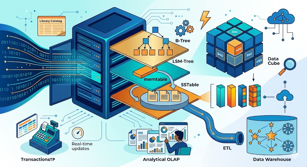
Data visualization is the superhero that swoops in, takes raw data – a mishmash of numbers and characters – and transforms it into visually intuitive, understandable information. It is like the Rosetta Stone of data, allowing us to decipher, interpret, and utilize the treasure trove of insights hidden within. Take ‘Non-Profit A’, for instance, drowning in a sea of fundraising data. We introduced them to the magic of data visualization, converting their raw data into interactive graphs and charts. Suddenly, the data was not only accessible but comprehensible, leading to improved understanding and informed decision-making.
Unearthing Patterns: The Crystal Ball of Data
Data visualization is like a crystal ball, revealing hidden patterns and trends. It takes disparate data points and weaves them into a coherent story, making it easy to spot correlations and trends that might otherwise have gone unnoticed. Consider ‘Association B’. They had membership data scattered across various spreadsheets. A custom data visualization tool brought this data to life, highlighting trends in membership growth and retention. This newfound insight allowed them to proactively address issues and make data-backed decisions about their recruitment strategies.
Driving Impact: Turning Insights into Action
But the real power of data visualization lies in its ability to drive action. By transforming complex data into digestible visual narratives, it empowers associations and non-profits to make impactful, informed decisions. Take ‘Non-Profit C’. They were struggling to allocate resources effectively across their programs. Data visualization revealed which programs had the most significant impact, leading to more efficient resource allocation and, a greater impact on their community. In the realm of data, visualization is king. It simplifies complexity, reveals hidden patterns, and drives impactful decision-making. So, it is time to embrace the power of data visualization, turning your raw data from an alien language into a treasure map that leads to insight and action.