The Problem That Started It All
“AI converted my UI to dark mode… but it doesn’t look right.”
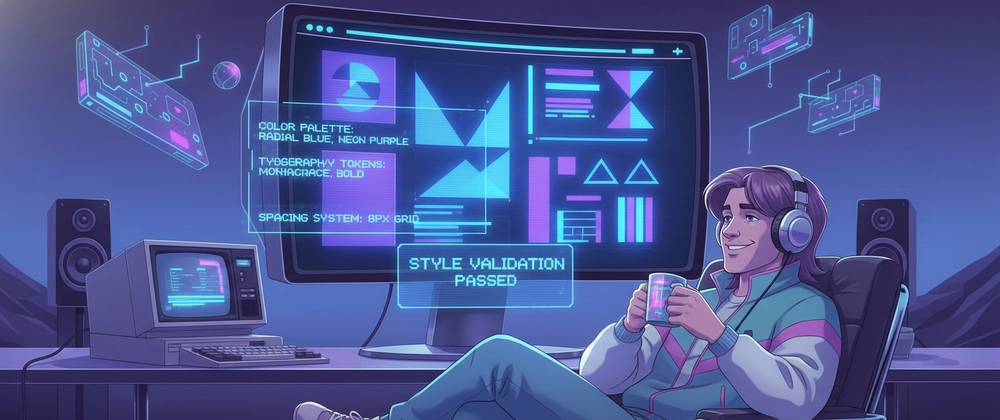
This was a recurring concern I kept hearing from my team. As more of us began relying on AI tools to speed up UI transformations, especially for converting light themes into dark themes, the results were often disappointing. While AI could generate outputs instantly, the quality rarely matched expectations.
The converted interfaces frequently suffered from harsh colors, poor contrast, broken visual hierarchy, and accessibility issues. The output was technically functional, but visually and experientially lacking.
It became clear that AI wasn’t truly designing dark mode, it was simply transforming colors without understanding the underlying principles.
From Observation to Exploration
Instead of treating this as a limitation of AI, I approached it as a design problem. What does a well-designed dark theme actually require? Why does a direct conversion fail?
This led me to explore dark theme design in depth, understanding its principles, accessibility requirements, and how color behaves differently in darker interfaces. I also examined where both AI systems and developers tend to fall short when attempting these transformations.
These learnings eventually formed the foundation of a session I conducted in Techno Elasticia.
Why AI Often Fails at Dark Mode

AI tools are efficient, but they lack design intent unless guided properly. In most cases, dark mode generation fails due to a few common issues:
- Use of pure black backgrounds
- Direct reuse of brand colors without adjustment
- Poor or incorrect contrast ratios
- Lack of visual hierarchy
As a result, the interface may meet basic functional requirements but fails to deliver a cohesive or comfortable user experience.
Understanding Dark Mode
A dark theme is not simply a color inversion. It is a UI approach where dark surfaces are used as primary backgrounds, with lighter elements layered for content and interaction.
Dark mode serves several purposes:
- Reduces eye strain in low-light environments
- Improves usability in dim settings
- Conserves battery life on OLED screens
- Offers users an additional personalization option
However, achieving these benefits depends entirely on how well the theme is designed.
Designing Dark Mode the Right Way
Based on the insights from my research and session, here are the key principles that significantly improve the quality of dark themes, whether designed manually or generated using AI.
1. Avoid Pure Black

Using pure black (#000000) for backgrounds often creates excessive contrast and visual fatigue. Instead, dark grey tones such as #121212 provide a softer and more readable experience.
This subtle shift improves comfort without compromising the aesthetic of a dark interface.
2. Reduce Color Saturation

Colors behave differently on dark backgrounds. Bright, saturated colors tend to appear more intense and can become visually overwhelming.
A better approach is to use softer, desaturated tones. Reducing saturation helps maintain balance and ensures that color is used intentionally rather than aggressively.
3. Maintain Accessibility Standards
Accessibility is one of the most overlooked aspects in AI-generated dark themes.
According to WCAG guidelines:
- Normal text should maintain a contrast ratio of at least 4.5:1
- Large text should maintain a minimum ratio of 3:1

To create branded dark surfaces, overlay the primary brand color at a low opacity over the recommended dark theme surface color (#121212). The color #1F1B24 is the result of combining the dark theme surface color #121212 and the 8% Primary color.
Ensuring proper contrast is essential not only for compliance but also for readability and usability across different user groups.
4. Use Brand Colors Strategically
One of the most common mistakes is applying brand colors in the same way as in light mode.

In dark themes, brand colors should be used sparingly and with intention:
- Apply full saturation only to key interactive elements
- Limit usage to one or two components such as primary buttons or logos
- Use desaturated variations for secondary elements
A useful technique is to overlay the brand color at low opacity on a dark surface rather than using it directly.
5. Handle Large Surfaces Carefully
Large areas in a dark UI should remain neutral and understated.


Dark grey surfaces work best for backgrounds, while brighter colors should be reserved for smaller, high-impact elements. Applying bright colors to large surfaces can disrupt visual balance and reduce readability.
Where Developers and Prompts Go Wrong
Even when using AI, the outcome is only as good as the input.
A common issue is the use of vague prompts such as “Convert this UI to dark mode.” Without specific guidance, AI defaults to basic transformations rather than thoughtful design.
Key aspects often missing in prompts include:
- Accessibility requirements
- Color behavior adjustments
- Visual hierarchy preservation
- Controlled use of brand elements
The Role of Better Prompts
Improving AI output does not necessarily require better tools, it requires better instructions.

A more effective prompt would be:
“Convert this UI to a dark theme using dark grey surfaces instead of pure black. Reduce color saturation, maintain WCAG contrast ratios (minimum 4.5:1 for text), preserve visual hierarchy, and use brand colors sparingly for key elements only.”
This level of specificity helps AI move from simple transformation to more design-aware output.
Conclusion
Dark mode is not a visual afterthought or a simple inversion of colors. It is a carefully constructed design system that requires attention to contrast, color behavior, hierarchy, and accessibility.
AI can accelerate the process, but it cannot replace design understanding. When guided with the right principles and prompts, however, it can become a powerful collaborator.
This exploration began with a recurring issue within my team and evolved into a deeper understanding of how we approach dark mode in the age of AI. The responsibility now lies with us, as designers and developers, to bridge the gap between automation and intention.


